
What is a Renko chart? Renko charts are a unique charting style originating from Japan that focuses solely on significant price movements, filtering out minor fluctuations and market noise. Unlike traditional charts that plot price against fixed time intervals, Renko charts build “bricks” only when the price moves by a predefined amount. For any trader working with an online forex broker, understanding this tool can be a game-changer for identifying trends and key support or resistance levels. This article will explain exactly what Renko charts are, how they are built, their core features, key differences from other chart types, and how to configure them on major trading platforms.
Key Takeaways
- Price-Driven, Not Time-Driven: Renko charts disregard time and focus exclusively on price movement. A new “brick” is only formed when the price travels a specific distance, making the time axis irregular.
- Superior Noise Reduction: By filtering out small, insignificant price moves, Renko charts provide a much cleaner view of the market, making it easier to identify the underlying trend.
- Brick Size is Key: The sensitivity of a Renko chart is determined by the renko brick size. This setting can be a fixed value (e.g., 10 pips) or based on the Average True Range (ATR) to adapt to market volatility.
- Clear Support & Resistance: The uniform nature of the bricks creates clear horizontal levels, making swing highs and lows that define support and resistance zones incredibly easy to spot.
- Delayed but Confirmed Signals: A significant limitation is that Renko charts can lag behind price action because a brick isn’t printed until the price threshold is met. This delay, however, often results in more confirmed and reliable signals.
What Is Renko Charts?
For traders tired of the constant noise and indecision presented by traditional candlestick or bar charts, the question “what is renko charts?” often leads to a powerful solution. Renko charts are a form of price charting that prioritizes clarity and trend identification above all else. The name “Renko” is derived from the Japanese word “renga,” which means “brick.” This is a fitting name, as the chart is constructed from a series of bricks, each representing a fixed price movement.
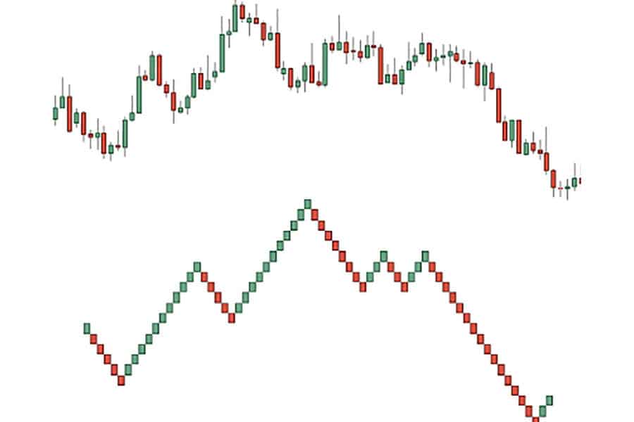
From my own experience, the first time I switched from a 15-minute candlestick chart to a Renko chart on a volatile pair like GBP/JPY, the difference was astounding. The choppy, sideways movements that previously clouded my judgment were gone. In their place was a clear series of ascending green bricks, showing a strong uptrend that was much harder to discern on the time-based chart. This is the core purpose of Renko: to distill price action down to its most meaningful movements. It achieves this by completely ignoring time. A new brick could form in five minutes during a volatile news event or take five hours during a slow, range-bound session. The only thing that matters is price meeting the threshold you define.
How Renko Charts Work (Bricks & Rules)
The magic of Renko charts lies in their simple but strict construction rules. Understanding these mechanics is essential to using them effectively. Unlike other chart types that can seem complex, the logic behind Renko is straightforward once you grasp the foundational elements of brick size and directional rules. This simplicity is one of its greatest strengths and a key part of its appeal to traders who favor a minimalist approach.
Renko Brick Size (Fixed, ATR, %)
The single most important setting you will configure is the renko brick size. This parameter dictates the sensitivity of the chart and determines how much the price needs to move before a new brick is drawn. Choosing the right renko brick size is a balance; too small, and you reintroduce the noise you were trying to filter; too large, and you risk missing important, tradable moves and receiving delayed signals. There are generally two methods for setting the brick size:
- Fixed Value: This is the most common method. You manually define the brick size in points, pips, or currency units. For example, on the EUR/USD forex pair, you might set a fixed brick size of 10 pips. This means a new brick will only form after the price has moved 10 pips from the previous brick’s boundary. I often use a fixed value for less volatile assets where I have a good sense of their typical price swings.
- Average True Range (ATR): This is a more dynamic approach. The ATR indicator measures market volatility. By setting the brick size to the ATR value (typically over a 14-period lookback), the chart automatically adjusts to the market’s current state. When volatility is high, the brick size increases to filter out the bigger swings. When volatility is low, the brick size decreases to remain sensitive to smaller moves. This is my preferred method for volatile instruments like indices or cryptocurrencies, as it adapts without constant manual adjustment.
Some platforms may also offer a percentage-based brick size, where the brick represents a certain percentage move in the asset’s price, though this is less common.
Up, Down, and Projection Bricks
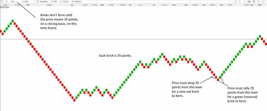
Renko charts follow a clear set of directional rules. Bricks are always of a uniform size and are drawn at a 45-degree angle from the previous brick, ensuring they never appear side-by-side in the same vertical column.
- Up-Bricks (Bullish): A new bullish brick (often colored green or white) is drawn when the price moves up by the chosen renko brick size from the top of the previous brick.
- Down-Bricks (Bearish): A new bearish brick (often colored red or black) is drawn when the price moves down by the chosen renko brick size from the bottom of the previous brick.
- Reversal Bricks: For the trend to reverse, the price must move two times the brick size in the opposite direction. For example, if the last brick was bullish and the brick size is 10 points, the price must fall 20 points from the top of that brick to print the first bearish brick (10 points to return to the brick’s starting level, and another 10 points to form the new bearish brick). This “two-brick” reversal rule is a fundamental characteristic and a major contributor to noise filtration.
- Projection Bricks: Some modern trading platforms, like TradingView, show a “projection brick” (or a “wick”) in real-time. This is a ghost brick that shows where the next brick will form if the current price movement continues and closes beyond the threshold. This is a useful feature for intraday traders as it gives a hint of developing price action, but it’s crucial to remember that this brick is not confirmed and can disappear (“repaint”) if the price reverses before the threshold is met and the period closes. Classic Renko charts, based only on closing prices, do not have this feature and are therefore considered more reliable, albeit slower.
Renko Chart Features
The unique construction of Renko charts gives them a distinct set of features that differentiate them from all other charting methods. These renko chart features are precisely why traders turn to them: to gain a specific analytical edge that time-based charts cannot provide. The primary goal is to achieve clarity, and every feature of a Renko chart is designed to support this objective. When I first started using them, the most impactful feature for me was the immediate simplification of price action. It allowed me to focus on the “what” (significant price movement) rather than the “when” (time).
- Price-Only, Time-Agnostic: As emphasized, Renko charts have a horizontal axis that does not represent uniform time intervals. Time is irrelevant. This is one of the most fundamental renko chart features. The chart progresses only when price moves, which is why you’ll see gaps in the date axis during periods of low activity.
- Noise Filtration: This is arguably the most celebrated feature. By requiring a minimum price move to form a brick, all smaller movements—the market “noise”—are ignored. This results in a much smoother chart that highlights the true underlying trend.
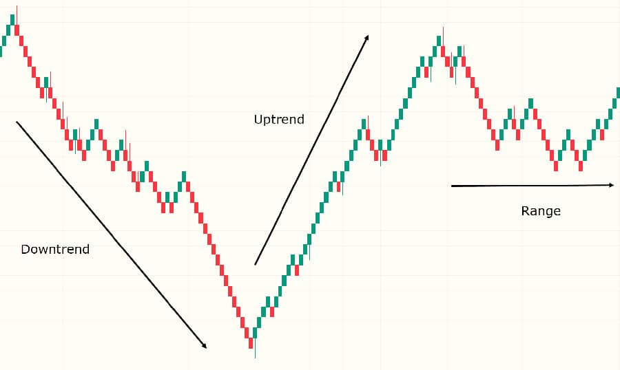
- Clear Trend Visualization: A sequence of consecutive same-colored bricks makes identifying a trend effortless. A series of green bricks signifies a strong uptrend, while a series of red bricks indicates a clear downtrend. Choppy, sideways markets are represented by alternating red and green bricks, making it obvious when a market lacks clear direction.
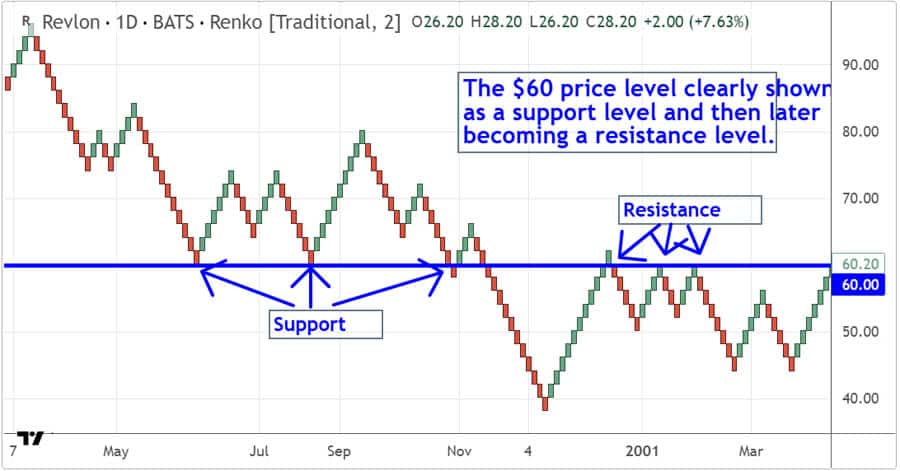
- Support and Resistance Identification: Swing highs and lows on a Renko chart are very distinct. Because bricks are uniform, they tend to reverse at similar price levels, creating clean, horizontal lines of support and resistance. These levels are often more reliable than those drawn on noisy candlestick charts.
- No OHLC Information: A classic Renko brick only represents the price movement that triggered its creation (based on the closing price). It does not show the open, high, low, or close of a trading period. While some modern platforms try to incorporate wicks, the traditional form of Renko deliberately omits this data to maintain simplicity. This is a critical trade-off: you gain clarity but lose the granular detail of intra-period price action.
Pros and Cons of Renko Charts
Like any tool in a trader’s arsenal, Renko charts come with their own set of advantages and limitations. From my experience, they are incredibly powerful when used in the right context but can be misleading if you don’t understand their drawbacks. Acknowledging both sides is key to integrating them into a robust trading plan. Many traders get drawn in by the clean look but fail to appreciate the trade-offs they are making.
Advantages (The Pros)
- Enhanced Trend Clarity: This is the number one benefit. By removing noise, trends are easier to see and follow. This helps traders stay in profitable trades longer and avoid getting shaken out by minor corrections.
- Effective Noise Reduction: Insignificant price fluctuations are filtered out, which helps in reducing false signals, especially in choppy or ranging markets.
- Clear Support and Resistance Levels: The uniform brick structure creates very obvious and clean horizontal support and resistance zones, which are fundamental for any technical analysis.
- Removes Subjectivity in Trend Analysis: A trend on a Renko chart is defined by the color of the bricks. It’s either up, down, or ranging. This removes the emotional and subjective interpretation that can sometimes plague traders using candlestick charts.
- Customizable Sensitivity: Through the renko brick size setting (fixed or ATR), a trader can fine-tune the chart’s sensitivity to match a specific asset’s volatility or their own trading style.
Limitations (The Cons)
- Lagging Nature: Because a brick only forms after a specific price move is completed, Renko charts are inherently lagging indicators. A fast-moving market might travel a significant distance before a new brick is even printed, causing a late entry or exit.
- Loss of Price Information: Classic Renko charts do not show the open, high, low, and close (OHLC) for a period. This means you can miss important information about intra-period volatility. For example, a huge price spike and reversal within a single candle might not even appear on a Renko chart if the net closing price move isn’t large enough to form a new brick.
- Potential for “Gaps”: The price can move several brick sizes before the chart updates. For example, with a 10-pip brick size, if the price suddenly jumps 50 pips due to a news release, five bricks will be printed at once on the chart. While this shows the magnitude of the move, you lose the detail of how the price got there.
- Brick Size Dilemma: Choosing the optimal renko brick size can be challenging. A size that works well in a trending market might perform poorly in a ranging market, leading to whipsaws. An ATR-based size helps, but it isn’t a perfect solution. This is a frequent point of frustration for new Renko users.
- Misleading Indicator Behavior: Applying traditional indicators like Moving Averages or RSI to Renko charts can be tricky. These indicators are calculated based on the Renko bricks, not on time. A “20-period” moving average on a Renko chart is an average of the last 20 bricks, not the last 20 days or hours. This can lead to very different signals compared to a time-based chart.
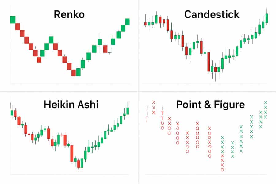
Renko vs. Other Chart Types
To truly appreciate what Renko offers, it helps to compare it directly with other popular chart types. Each has its own philosophy and presents market data in a unique way. As a trader, I don’t see it as a matter of one being “better” than another, but rather which tool is right for the specific job at hand. Often, I use Renko charts in conjunction with candlestick charts to get both a “clean” view and a “detailed” view.
| Chart Type | Core Principle | Primary Advantage | Primary Disadvantage |
| Renko Charts | Plots fixed price moves (“bricks”), ignores time. | Excellent noise reduction and trend clarity. | Lags price and omits OHLC data. |
| Candlestick Charts | Plots OHLC price data over fixed time intervals. | Provides detailed price information for each period. | Can be “noisy” and make trends difficult to see. |
| Heikin Ashi Charts | Averages OHLC data to create “smoother” candles over fixed time intervals. | Good at showing trend direction while remaining time-based. | The candle prices do not reflect the true market price. |
| Point & Figure Charts | Plots price moves in columns of X’s and O’s, ignores time. | Excellent for identifying support/resistance and chart patterns. | Can be complex to learn and interpret for beginners. |
Renko vs. Candlestick
This is the most common comparison. A candlestick chart gives you a complete picture of the battle between buyers and sellers within a fixed time frame (e.g., one hour). You see the open, high, low, and close. Renko charts strip away this detail to focus on one question: has the price moved enough to matter? If you are a scalper who needs to see every tick and wick, candlesticks are indispensable. If you are a swing or position trader who wants to focus on the dominant trend, Renko is superior.
Renko vs. Heikin Ashi
Heikin Ashi charts also aim to smooth price action and make trends easier to see. However, they do so by using a mathematical formula to average the OHLC of the current and prior bar. Crucially, Heikin Ashi charts are still time-based. A new candle prints at the end of every time interval, regardless of price movement. Renko is purely price-based. I find Heikin Ashi to be a good middle-ground, but for ultimate noise filtration, Renko remains my preferred tool.
Renko vs. Point & Figure
Point & Figure (P&F) is the other major chart type that ignores time. P&F charts use columns of X’s (for rising prices) and O’s (for falling prices) to represent price movements. Both Renko and P&F are excellent for identifying support and resistance levels. The main difference is the visual representation. Renko uses uniform bricks plotted diagonally, which many modern traders find more intuitive and visually simpler than the columns of X’s and O’s on a P&F chart.
Interpreting Renko Chart Signals
Learning to read Renko charts is less about complex patterns and more about understanding what the bricks are telling you in their simplest form. This section focuses on interpretation, not a trading strategy. The goal is to understand the information being conveyed. Again, this is one of the main renko chart features that traders find so attractive. It provides a clean canvas for analysis.
- Trend Direction: This is the most basic signal. A series of consecutive green (or bullish) bricks indicates an uptrend. A series of red (or bearish) bricks indicates a downtrend. The longer the series, the stronger the trend.
- Swing Highs and Lows: A swing high is formed when a bullish trend reverses to bearish (a green brick followed by a red brick). A swing low is formed when a bearish trend reverses to bullish (a red brick followed by a green brick). These points are critical for identifying support and resistance levels.
- Trend Reversals: The classic signal of a potential trend change is the “two-brick” reversal. The appearance of one or two bricks of the opposite color after a sustained trend can be the first sign that the momentum is shifting. For example, after a long run of green bricks, the appearance of two consecutive red bricks is a strong warning that the uptrend may be over.
- Volatility Assessment: You can get a “feel” for market volatility by observing how frequently new bricks are printing. If bricks are forming rapidly, it indicates high volatility. If the chart goes static for a long period, it shows a lack of volatility or a tight trading range. When using an ATR-based renko brick size, the size of the bricks themselves gives you a direct visual cue about changing volatility.
Renko Settings on Trading Platforms
Most modern trading platforms offer Renko charts, but the settings and implementation can vary. Understanding the key options on your platform is crucial for setting up the chart correctly. When I mentor new traders, I always tell them to spend time in their platform’s documentation to understand exactly how their Renko bricks are calculated—is it based on the close, or does it incorporate wicks?
Here are the common settings you’ll find on platforms like TradingView, cTrader, MT4/MT5 (often with a custom indicator), and others:
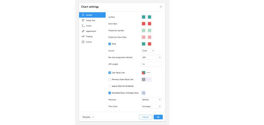
- Source Price: This setting determines which price is used to calculate brick formation. The most common and traditional method is using the “Close” of each period. Some platforms may allow you to use High/Low, which can make the chart more sensitive but also introduce more noise.
- Brick Size Assignment: This is where you choose between “Fixed” (Traditional) or “ATR”. If you select ATR, you will also need to specify the ATR length (14 is the standard).
– Brick Size Value: Here you input the actual value for your chosen method (e.g., 10 for pips, or 14 for the ATR period).
- Wicks/Projections: This is a key platform-specific feature. As mentioned, platforms like TradingView can show wicks or projection bricks. Be aware if this is enabled and understand that these elements can “repaint” (change) until the price move is confirmed.
Practical Setup Examples
Let’s walk through two concrete examples to solidify the concepts. These non-strategy examples are purely to illustrate how the chart works in practice.
Fixed Brick Size Example
Imagine you are trading a stock index like the S&P 500 E-mini futures (ES) and you set a fixed renko brick size of 2 points.
- The last confirmed brick was a bullish brick that closed at a price of 4500.00. The top of this brick is at 4500.00 and the bottom is at 4498.00.
- For a new bullish brick to be printed, the price must rise to 4502.00 (the top of the last brick + 2 points). Any movement between 4500.00 and 4501.75 will not be shown on the chart.
- For a bearish reversal brick to be printed, the price must fall to 4496.00 (the top of the last brick – 4 points, or 2x the brick size). This is because the price first has to move down 2 points to negate the last bullish brick, and then another 2 points to form the new bearish one.
ATR Brick Size Example
Now, let’s say you’re trading a volatile forex pair like GBP/JPY on a platform that supports ATR-based Renko.
- You select “ATR” as the brick size method and set the ATR length to 14.
- The platform looks at the 14-period ATR value on the underlying time-based chart (e.g., a daily chart). Let’s say the current ATR value is 95 pips.
- The platform will automatically set the renko brick size to 95 pips.
- If, over the next few days, market volatility dries up and the 14-period ATR value drops to 60 pips, the Renko chart will automatically adjust and start printing smaller 60-pip bricks. This adaptability is the key advantage of using the ATR method.
Data Notes and Important Caveats
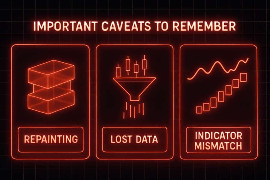
Before you fully commit to using Renko charts, it’s vital to be aware of a few technical details and caveats that can impact your analysis. These are points I’ve learned to respect over years of use, as ignoring them can lead to flawed conclusions.
- Closing Price vs. Intraday Volatility: Traditional Renko charts built on closing prices can be deceptive. A candle on a time-based chart might have a very long wick, indicating huge intraday volatility, but if the closing price is near the previous period’s close, no new Renko brick may form. You are sacrificing this detail for smoothness. Always be aware of what you’re not seeing.
- The “Repainting” Issue: This is specific to Renko implementations that show real-time projection bricks or wicks. These are not confirmed signals. A projection brick can appear and disappear multiple times before the price move is finalized. Never make a trading decision based solely on a projection brick. Wait for the brick to be fully formed and confirmed.
- Indicator Calculation Mismatch: This point cannot be overstated. If you apply a 20-period Simple Moving Average (SMA) to a daily candlestick chart, it shows you the average price over the last 20 days. If you apply a 20-period SMA to a Renko chart, it shows you the average price over the last 20 bricks. Those 20 bricks could have formed over 10 days or 50 days. The timeframes are not comparable. You must re-calibrate and re-test all your indicator settings specifically for the Renko environment.
So, when you hear someone ask, “what is renko charts?”, you can now explain not just the definition, but also the crucial nuances that make them a unique and powerful, yet specialized, tool for technical analysis.
Trade with a Cutting-Edge Broker
Elevate your trading with Opofinance, a globally recognized and ASIC-regulated forex broker. Access the markets with advanced tools and superior conditions.
- Powerful Platforms: Choose from MT4, MT5, cTrader, and the proprietary OpoTrade platform.
- Innovative AI Tools: Gain an edge with our AI Market Analyzer, AI Coach, and 24/7 AI Support.
- Flexible Trading: Explore opportunities with Social Trading and Prop Trading programs.
- Secure & Easy Transactions: Enjoy safe, convenient deposits and withdrawals, including crypto payments with zero fees.
Join thousands of traders who trust Opofinance for a premium trading experience. Start Trading Today!
Conclusion
Renko charts offer a compelling alternative to traditional time-based charting by focusing exclusively on price momentum. Their greatest strength is their ability to filter out market noise, providing a cleaner view of trends and key support and resistance levels. While they come with trade-offs, namely a lag in signals and a loss of detailed price data, their benefits in simplifying price action are undeniable. By understanding their construction, features, and limitations, traders can effectively incorporate these powerful charts into their analysis toolkit to make more confident, trend-aligned decisions.
Are Renko charts good for scalping?
Generally, Renko charts are not ideal for scalping. Their lagging nature means scalpers might miss small, rapid price moves. They are better suited for swing and position traders who aim to capture larger trends.
Can you use Fibonacci tools on Renko charts?
Yes, you can use Fibonacci retracement and extension tools on Renko charts. The clear swing highs and lows provided by the bricks make for excellent anchor points for drawing these levels.
How do volume indicators work with Renko charts?
Volume is typically displayed based on the underlying time-based bars. So, while a Renko brick may represent a large price move, the associated volume bar shows the total volume traded during the entire time it took for that brick to form.
Do Renko charts work for all assets?
Yes, Renko charts can be applied to any asset, including stocks, forex, commodities, and cryptocurrencies. They are particularly effective on assets that have clear trending phases.
What is the main difference between Renko and a range bar chart?
Both ignore time, but they form differently. Renko bricks have a “two-brick” reversal rule. Range bars are all the same height and a new bar prints immediately in the opposite direction once its range is exceeded, without needing a 2x move.
References: