
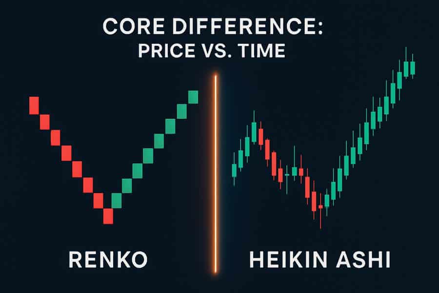
When navigating the markets, traders constantly seek clarity amidst the chaos of price fluctuations. The choice of charting tool is a pivotal decision in this quest. The debate over renko charts vs heikin ashi comes down to a fundamental trade-off: do you prioritize clean price structure or smooth trend continuity? Renko charts are built purely on price movement, ignoring time to filter out market noise and reveal key levels. Heikin Ashi, conversely, averages price data to create smoother, time-based candles that excel at visualizing the strength and direction of a trend. This article will dissect these differences, helping you decide which is better for your analytical style, without delving into specific strategies. For execution, partnering with a reliable online forex broker is essential for accessing these advanced chart types.

Key Takeaways
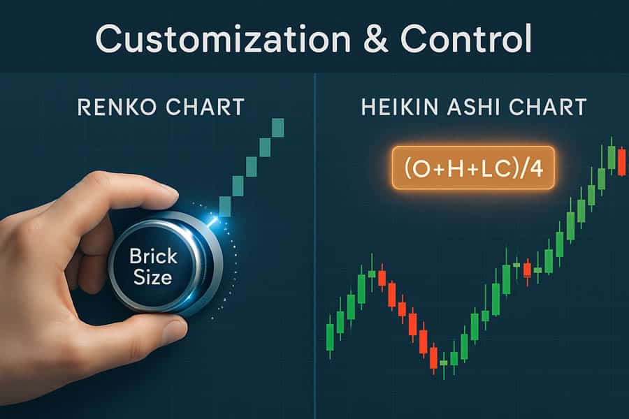
- Fundamental Construction: Renko charts are built on price movement alone, creating “bricks” only when a predefined price threshold is met, which makes them time-independent. Heikin Ashi charts are time-based and use a mathematical formula to average price data, creating smoother candlesticks.
- Noise Filtering: Both tools aim to reduce market noise, but they do so differently. Renko provides superior noise filtration by completely ignoring price movements smaller than the set brick size. Heikin Ashi smooths noise but still plots a candle for every time interval.
- Trend Visualization: Heikin Ashi excels at displaying trend continuity, with long strings of same-colored candles making it visually intuitive to follow a trend. Renko clarifies trend structure, showing distinct swing highs and lows with clean lines.
- Lag and Confirmation: Both charts introduce lag. Renko’s lag comes from waiting for a price move large enough to print a new brick. Heikin Ashi’s lag is a result of its averaging formula. This means both offer delayed but cleaner signals compared to standard candlesticks.
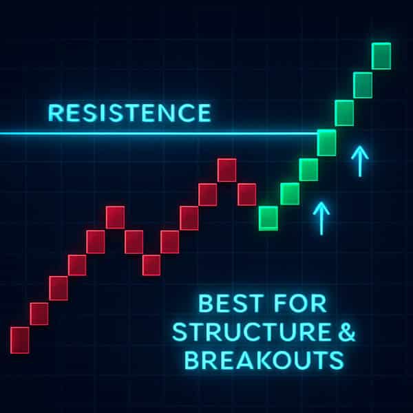
- Primary Use Case: The choice between renko charts vs heikin ashi depends on your goal. Renko is ideal for identifying support/resistance levels and clear breakout patterns. Heikin Ashi is better suited for trend-following and managing positions within a sustained move.
Comparison Table: Renko vs Heikin Ashi
| Aspect | Renko | Heikin Ashi |
| Core Construction | Price-only bricks form after a fixed move; time is ignored, so no new brick without threshold movement. | Time-based candles using averaged OHLC formulas to smooth price action and reduce noise. |
| Signal Behavior | Strong noise filtering, clearer structure, but delayed until brick size is met. | Smoother trends with some lag; better at visual trend continuity and fewer abrupt flips than standard candles. |
| Interpretation | Clean trend legs, support/resistance levels are easier to see; patterns stand out. | Continuous trend visualization; color consistency helps hold trends longer, but patterns can be less distinct. |
| Customization | Requires brick size (fixed or ATR/dynamic), which controls sensitivity and lag. | Standard formula; fewer knobs to tune, consistent smoothing behavior. |
| Best Fit | Structure-first analysis, breakouts, trend clarity, and post-noise confirmation. | Trend following over time, managing positions, reducing whipsaws on time frames. |
| Trade-offs | Can miss early parts of moves; in high volatility can stack delayed bricks. | Smoothing introduces lag and can hide micro reversals; less ideal for ultra-fast scalping. |
What Is Renko?
Renko charts are one of the most unique visualization tools available to traders, deriving their name from the Japanese word “renga,” which means “brick.” This name is incredibly fitting, as the chart is composed of a series of bricks that paint a picture of price movement stripped of all its minor fluctuations. The core principle of Renko is its complete disregard for time. A new brick only forms when the price moves a specific, predetermined amount. If the market is choppy and moving sideways within a tight range, a Renko chart will remain static, printing absolutely nothing. This is its greatest strength and a defining characteristic in the renko charts vs heikin ashi discussion.
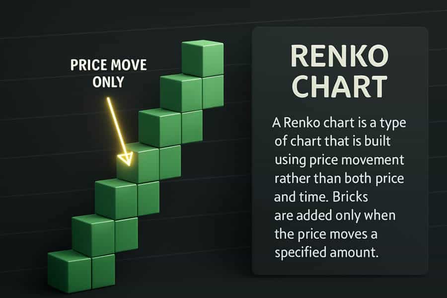
The construction is simple: you define a “brick size.” For instance, if you set the brick size to 10 points on an index, a new upward (typically white or green) brick will only appear once the price has risen 10 points from the close of the previous brick. Conversely, a new downward (typically black or red) brick requires a 10-point drop. A crucial rule is that bricks do not form next to each other; they always appear at a 45-degree angle up or down from the prior brick. This means to reverse a trend—say, from up to down—the price must fall by twice the brick size.
How Brick Size Controls Sensitivity
The entire behavior of a Renko chart hinges on the brick size setting. This is the primary customization tool at a trader’s disposal. A small brick size makes the chart highly sensitive to price changes, resulting in more bricks and a more detailed view of price action. However, this also reintroduces a degree of noise. A large brick size, on the other hand, creates a much smoother chart that only captures significant, long-term trends. It filters out almost all minor volatility but comes at the cost of significant lag. The market might move considerably before a new brick is finally printed, meaning you confirm a trend later but with much higher conviction. The choice of brick size—whether a fixed value or a dynamic one based on the Average True Range (ATR)—directly controls the balance between sensitivity and lag, a key consideration for any analyst.
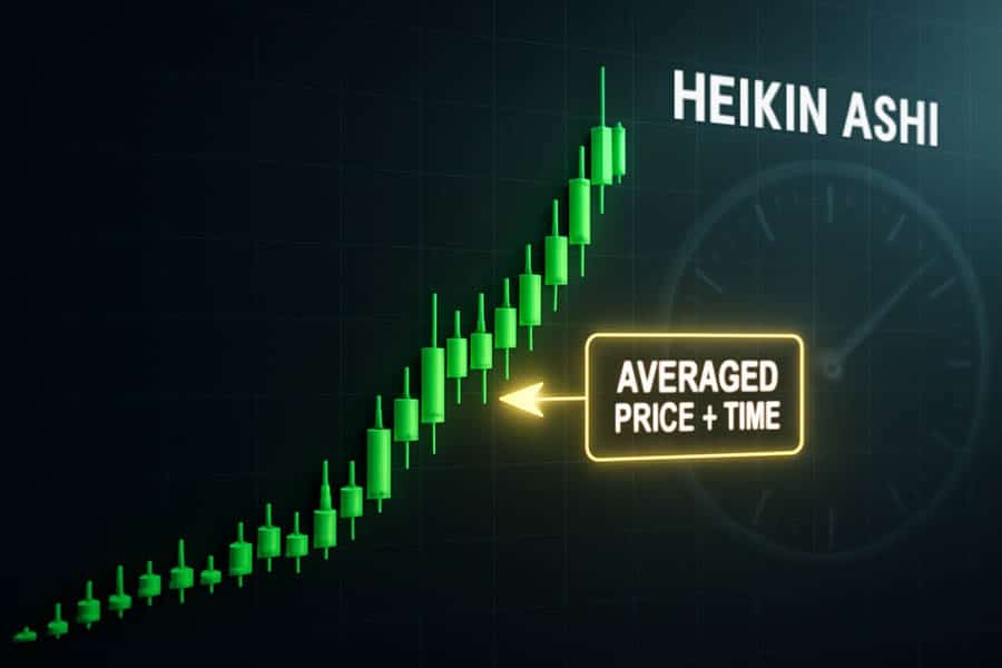
What Is Heikin Ashi?
Heikin Ashi, which translates from Japanese as “average bar,” is another powerful tool designed to reduce market noise and highlight trend direction. Unlike Renko, Heikin Ashi (HA) charts are time-based. This means that for every standard time interval (e.g., one hour, one day), a new Heikin Ashi candle is printed, regardless of price movement. This makes it fundamentally different from Renko and is a central point in the heikin ashi vs renko debate. Its primary function is not to eliminate noise by ignoring it, but to smooth it out through a mathematical formula.
Each Heikin Ashi candle uses a modified formula based on the open-high-low-close (OHLC) of both the current and previous standard candles. The formulas are:
- HA Close: (Open + High + Low + Close) / 4 — The average price of the current bar.
- HA Open: (Previous HA Open + Previous HA Close) / 2 — The midpoint of the previous HA bar.
- HA High: The maximum of the current High, HA Open, or HA Close.
- HA Low: The minimum of the current Low, HA Open, or HA Close.
The result is a chart of candles that look much smoother than standard candlesticks. Trends are characterized by long sequences of same-colored candles (e.g., green for uptrends, red for downtrends) with very small wicks, or in strong trends, no lower wicks in an uptrend and no upper wicks in a downtrend. This continuous trend visualization is the hallmark of Heikin Ashi.
Core Differences At A Glance
The primary renko vs heikin ashi difference lies in their construction and relationship with time. Understanding this is crucial to appreciating their distinct use cases. One is a pure price filter; the other is a price smoother. This single distinction dictates everything else, from how they handle noise to how they represent trends.
Price-Only vs. Time-Averaged
Renko is a price-only chart. Let’s use a practical example: imagine a stock is trading at $100 and you set a $1 brick size. If the price fluctuates between $100.10 and $100.90 for an entire hour, a standard one-hour candlestick chart would show a bar, but a Renko chart would show absolutely nothing. Not a single new brick would print until the price definitively moves to $101 (for an up brick) or $99 (for a down brick). Time is irrelevant.
Heikin Ashi is time-based and averaged. In that same scenario, a one-hour Heikin Ashi chart would print a new candle at the end of the hour. That candle’s appearance would be an average of the price action within that hour, linked to the previous HA candle. It might show a small-bodied candle with wicks on both sides, indicating indecision, but it will still appear. This ensures the x-axis (time) remains constant, unlike a Renko chart where the x-axis is distorted. This is a critical point in the renko charts vs heikin ashi comparison, as it impacts how you analyze market rhythm.
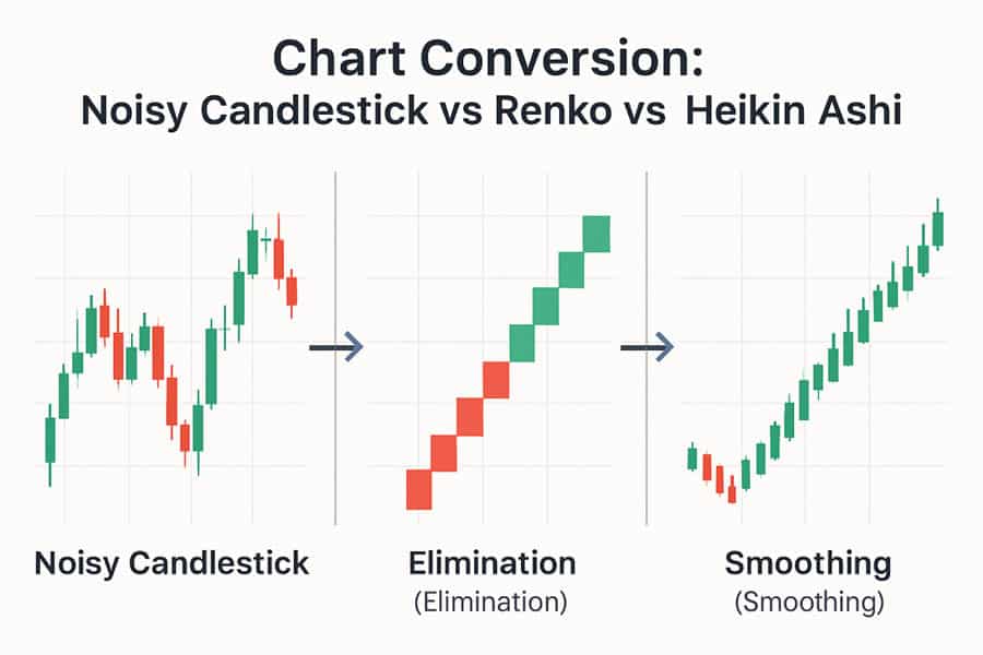
How Each Handles Noise
Both charting methods were invented to solve the same problem: the distracting noise of volatile price action. However, their approaches are philosophically different, leading to distinct visual outputs. The question of renko vs heikin ashi which is better for noise handling depends on whether you want to filter noise out completely or just smooth it over.
Renko: Noise Elimination by Threshold
Renko’s method is surgical. It sets a threshold (the brick size) and simply discards any price movement that doesn’t meet it. This is not smoothing; it’s elimination. The practical implication is profound. A Renko chart presents a clean, almost sterile view of the market’s true direction. Minor pullbacks during a strong trend, which might cause panic on a candlestick chart, often don’t even register on a Renko chart. This makes it incredibly effective at reducing whipsaws and preventing over-trading based on insignificant fluctuations. From my experience, traders who get easily shaken out of positions find Renko’s clarity to be a game-changer for their psychology. The trade-off is that you are intentionally blinding yourself to micro-structures and small reversals that might be important for other forms of analysis.
Heikin Ashi: Noise Reduction by Averaging
Heikin Ashi’s approach is more like applying a calming balm to price action. It doesn’t eliminate the data from small swings; it incorporates them into its averaging formula. The result is that while a Heikin Ashi chart is significantly smoother than standard candlesticks, it still reflects the underlying volatility to a degree. You will see small candles and wicks during periods of consolidation, whereas a Renko chart might show nothing. Heikin Ashi reduces noise by preventing the jarring color flips and long wicks seen on standard charts. A minor dip in an uptrend won’t create a scary red candle; it will likely appear as a green candle with a small body and a lower wick, signaling a pause rather than a reversal. This makes it excellent for managing positions within a trend, as it provides a less alarming visual experience.
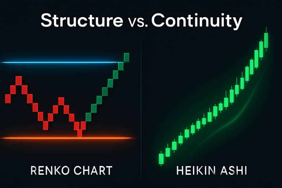
Reading Trends And Structure
A chart’s primary purpose is to help a trader interpret market behavior. In this regard, the renko charts vs heikin ashi comparison reveals two different ways of looking at trends and market structure. One excels at showing the skeleton of the market, while the other excels at showing its momentum.
Renko for Clean Structure and Levels
Because Renko bricks are uniform in size and ignore time, they create exceptionally clean swing highs and swing lows. This makes identifying horizontal support and resistance levels remarkably easy. A horizontal line of brick tops or bottoms becomes a clear area of supply or demand that stands out without the clutter of candle wicks. Chart patterns like double tops, head and shoulders, or triangles also appear in a simplified, almost textbook form. For traders who base their decisions on classical chart patterns and structural analysis, Renko offers an unparalleled level of clarity. The “legs” of a trend are distinct, and it’s easy to see when a previous support level has been broken and a new trend has begun. This structural clarity is a major advantage of the Renko system.
Heikin Ashi for Trend Continuity
Heikin Ashi’s strength lies in visualizing the persistence and health of a trend. A strong uptrend on a Heikin Ashi chart is a beautiful sight: a long series of green candles with no lower wicks. This visually screams “strong momentum.” As the trend begins to weaken, the candle bodies will get smaller and lower wicks will start to appear. A potential reversal is often signaled by a doji-like candle followed by a candle of the opposite color. This color consistency helps traders stay in a winning trade longer, as the chart doesn’t produce the intimidating opposite-colored candles that often appear during minor pullbacks on a standard chart. It promotes psychological conviction. However, this same smoothing quality can obscure the precise price levels and patterns that are so clear on a Renko chart. This is a key renko vs heikin ashi difference.
Lag And Confirmation
A common critique of both Renko and Heikin Ashi is that they “lag.” This is true, but it’s also by design. The lag is a direct result of the noise-filtering process. The goal isn’t to be the fastest indicator, but to be a more reliable one. Understanding where the lag comes from in each is vital for setting realistic expectations.
Renko’s Threshold Delay
The lag in Renko charts is a “threshold delay.” The chart waits for price to travel a certain distance before it updates. If you have a $5 brick size and the market moves $4.99 in your favor, the chart won’t show it. It waits for that final cent to confirm the move and print the brick. During periods of extremely high volatility, this can lead to a phenomenon where several bricks print in quick succession, making it appear as if the chart “jumped.” In reality, the price moved that distance very quickly, and the chart is just catching up. This results in what many traders call “late but cleaner” confirmation. You miss the very beginning of a move, but you enter after it has shown some commitment.
Heikin Ashi’s Averaging Delay
Heikin Ashi’s lag comes from its averaging formula. Because each HA candle’s open and close is derived from an average that includes the previous candle’s data, it will inherently move slower than the actual price. The price displayed on a Heikin Ashi chart is not the true market price. For example, the close of the last HA candle is not where the asset is currently trading. This is a crucial point many new users miss. This smoothing delay means that trend changes appear more gradually. While this prevents whipsaws, it also means the confirmation of a new trend will come later than it might on a standard candlestick chart. The turn is smoother but less precise in its timing compared to the raw price action.
Customization And Control
The degree to which a trader can fine-tune their tools is an important practical consideration. In this area, the philosophies behind renko charts vs heikin ashi are again quite different. One offers significant user control, while the other is more of a “one size fits all” solution.

Renko: The Power of Brick Size
As discussed, the brick size is the heart of Renko customization. This parameter gives the trader complete control over the chart’s sensitivity. A day trader on a volatile instrument might use a small, fixed brick size or a low-multiple ATR setting to capture shorter swings. A long-term position trader on a less volatile asset might use a very large brick size to focus only on major secular trends. This adaptability across different assets and timeframes is a huge plus. However, it also introduces the risk of “curve-fitting,” where a trader might endlessly tweak the brick size to make past price action look perfect, which is not a sound analytical process. The control is a double-edged sword that requires discipline.
Heikin Ashi: A Standardized Formula
Heikin Ashi, in its standard form, offers very little customization. The mathematical formula is fixed. You can’t change the way it calculates the averages. This can be seen as both a pro and a con. The advantage is its consistency and simplicity. A Heikin Ashi chart on Gold will behave in the same way as one on EUR/USD. There are no parameters to second-guess. This makes it a robust, portable tool that a trader can learn once and apply everywhere. The disadvantage is the lack of flexibility. If the standard smoothing isn’t suitable for a particular market’s volatility profile, you can’t adjust it. You’re stuck with the default behavior, which might be too slow for very fast markets or too sensitive for very quiet ones.
When Renko Makes Sense
Choosing Renko is a deliberate decision to prioritize price structure above all else. It makes sense in specific analytical contexts where the “what” (price level) is more important than the “when” (time). From my experience, traders gravitate towards Renko when they are focused on breakout trading and level identification. When a market has been in a range for a long time, a Renko chart will show a flat top and bottom. The moment a brick closes beyond that range, it’s an unambiguous breakout signal. There’s no wick to second-guess; it’s a clear structural shift. It is also excellent for analysis after a high-impact news event, as it filters out the initial chaotic whipsaws and only shows the true direction once the dust has settled. If your primary goal is to map the market’s skeleton and identify key bones of contention (support and resistance), Renko is a superior tool. The debate of renko charts vs heikin ashi often concludes with Renko being the choice for structural purists.
When Heikin Ashi Makes Sense
A trader should turn to Heikin Ashi when their primary goal is to ride a trend and manage their position with emotional discipline. The visual power of Heikin Ashi to show trend continuity cannot be overstated. Seeing a long, uninterrupted string of green candles makes it psychologically easier to hold onto a winning long position and not sell too early on a minor dip. It’s an excellent tool for reducing the “noise” in a trader’s own mind. It helps in visually confirming momentum. For instance, in a strong uptrend, the absence of lower wicks on HA candles is a powerful confirmation of buying pressure. When lower wicks start to appear, it’s a visual cue that the momentum is waning. This makes Heikin Ashi a great companion for trend-following systems, where the goal is to capture the majority of a large move. If your focus is on trend persistence and momentum visualization, the answer to the heikin ashi vs renko question leans heavily towards HA.
Practical Limitations To Note
No tool is a holy grail, and it’s irresponsible to discuss the merits of renko charts vs heikin ashi without being transparent about their limitations. Both are visual aids, not predictive engines. They lag reality by design and can give misleading impressions if used without context. Renko’s delay can be significant in a trending market, meaning you might only get confirmation after a large portion of the move has already occurred. In a “flash crash” scenario, the delayed stacking of bricks can be disorienting. Heikin Ashi’s smoothing can be a major drawback for scalpers or traders who need to see precise price action, as it can completely hide small but important reversal patterns that are visible on a standard candlestick chart. Furthermore, the price on a Heikin Ashi chart is not the real tradable price, which can confuse execution. Both tools should be used as one piece of a larger analytical puzzle, contextualized with other factors like volume, market sentiment, and fundamental drivers.
Trade with a Cutting-Edge Broker
To make the most of advanced charting tools like Renko and Heikin Ashi, you need a broker that provides a powerful and reliable trading environment. Opofinance, regulated by ASIC, offers a comprehensive suite of platforms and tools for the modern trader.
- Advanced Trading Platforms: Choose from MT4, MT5, cTrader, and the intuitive OpoTrade app.
- Innovative AI Tools: Gain an edge with our AI Market Analyzer, AI Coach, and 24/7 AI Support.
- Flexible Trading Options: Explore Social Trading and Prop Trading opportunities.
- Secure & Convenient Transactions: Enjoy safe and flexible deposits and withdrawals, including crypto payments with zero fees.
Start Trading with Opofinance Today
Conclusion
The journey to selecting the right chart ends not with a universal winner, but with a personal choice aligned with your analytical style. The renko charts vs heikin ashi debate is a perfect illustration of this. Renko offers unparalleled clarity of market structure by divorcing price from time, making it ideal for identifying key levels and breakouts. Heikin Ashi provides a smoothed, continuous view of a trend’s momentum, making it a powerful ally for trend-followers. Your decision on which is better rests on a simple question: Are you trying to read the market’s structure or its flow?
Which chart is better for day trading?
It depends on the strategy. A day trader focused on clean breakouts from ranges might prefer Renko with a small brick size. A day trader aiming to ride intraday trends and avoid whipsaws might prefer Heikin Ashi on a 5-minute or 15-minute chart.
Do Renko bricks change after they are printed?
No, once a Renko brick is fully formed and printed (i.e., the price has met the threshold), it does not change or repaint. However, the “current” or “in-progress” brick will change dynamically until the price threshold is met, at which point it becomes permanent.
Can you use volume with Renko charts?
Yes, but it’s interpreted differently. Since Renko bricks are not time-based, a volume bar associated with a brick shows the total volume traded during the entire (and variable) time it took for that brick to form, not the volume for a fixed time interval.
Is Heikin Ashi more accurate than standard candles?
“Accuracy” is not the right term. Heikin Ashi is not more or less accurate; it’s a different representation of the same data. It is arguably better at indicating trend direction due to its smoothing, but it is less accurate in representing the exact open, high, low, and close prices for a period.
Why does the Heikin Ashi chart show a different price than the real market price?
This is due to its core averaging formula. The close of a Heikin Ashi candle is the average of the open, high, low, and close of the standard candle. The open is the average of the previous Heikin Ashi candle’s open and close. This calculation means the HA price is a derived value, not the live market price.
Related References: