
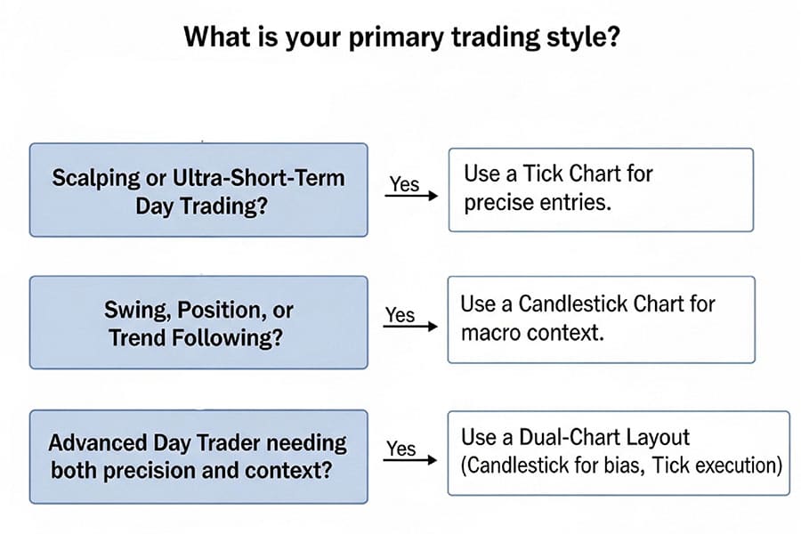
In the tense battle of tick chart vs candlestick, the right choice depends entirely on your trading objective. For scalpers needing to detect immediate momentum shifts, tick charts are superior as they form bars based on a set number of transactions, not time. Conversely, for swing or position traders, time-based candlestick charts provide essential context for broader market trends. This article will dissect the tick chart vs candlestick advantages, show you how to use them for day trading, and explore advanced dual-chart strategies, empowering you to select the best tool with a reliable online forex broker.

Key Takeaways
- Verdict First: Tick charts excel at showing micro-level supply and demand by plotting a new bar after a fixed number of trades, making them ideal for scalping and detecting momentum bursts. Candlestick charts, based on fixed time intervals, are better for trend analysis and identifying classic patterns over longer periods.
- Core Mechanic: The fundamental difference lies in the x-axis. Tick charts have a variable time axis dependent on transaction volume, while candlesticks have a fixed time axis. This makes tick charts sensitive to market activity and candlesticks sensitive to the clock.
- Day Trading Application: In the tick chart vs candlestick for day trading debate, tick charts can offer clearer signals and tighter stop-losses during volatile periods by filtering out low-activity “noise.” However, time-based candles are crucial for aligning with session-based institutional activity.
- Advantages & Disadvantages: Tick charts reduce noise during slow periods but can accelerate rapidly during high volume, potentially overwhelming new traders. Candlesticks provide consistent, easy-to-read context but can obscure the true volume and liquidity driving price moves.
- Hybrid Strategy: The professional approach often involves using both. A higher time-frame candlestick chart (e.g., 5-minute or 1-hour) defines the overall trend and key levels, while a lower-granularity tick chart (e.g., 2000-tick) pinpoints precise entries and exits.
- Platform Nuances: Not all platforms support true tick charts. While specialized platforms like NinjaTrader and Sierra Chart excel, traders on platforms like TradingView may need to use Volume-based bars or Range bars as a proxy.
TL;DR – When to Use Each Chart
In the fast-paced world of trading, choosing the right chart type is a critical first step. The tick chart vs candlestick decision isn’t about which is universally better, but which is situationally superior. Below is a quick comparison and a flowchart to help you decide in under a minute.
Quick Comparison
| Feature | Tick Chart | Candlestick Chart |
|---|---|---|
| Speed | Reacts to transaction volume, faster in high activity | Fixed pace based on time, consistent speed |
| Noise Filtering | Excellent, ignores periods of low activity | Prone to noise during slow market hours |
| Context | Micro-level, shows order flow pressure | Macro-level, shows trend over time |
| Platform Support | Less common, requires specific platforms | Universal, available on all platforms |
Tick Charts in Plain English
To truly grasp the tick chart vs candlestick debate, we must first understand the fundamental building block of a tick chart: the “tick” itself.
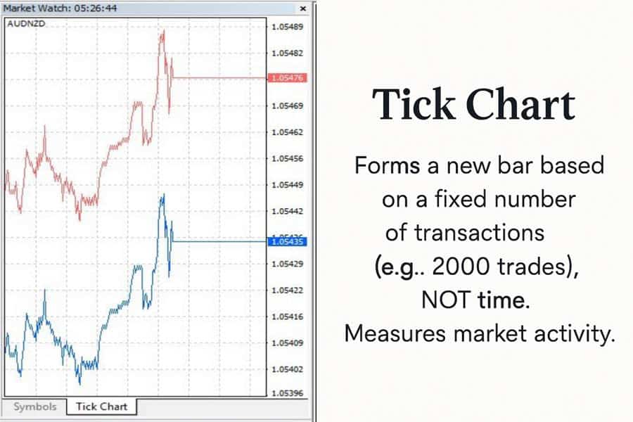
What is a “tick”?
A “tick” is simply a single executed trade or transaction. It has a price and a size (volume), but the tick itself is just one event. A tick chart is constructed by grouping a pre-defined number of these transactions into a single bar. For example, a 2,000-tick chart will print a new bar every time 2,000 trades have been executed, regardless of how long it took.
This is the crucial distinction. During a frantic market open, a 2,000-tick bar might form in just a few seconds. Conversely, during a quiet pre-holiday lunch session, it could take over an hour for the same bar to complete. This reveals the chart’s core feature: it measures market activity, not time.
Why no time axis → volume-sensitive bars
Because the x-axis is not fixed to time, tick charts are inherently volume-sensitive. The speed at which bars print is a direct visual indicator of market participation. When the chart accelerates, you know significant volume is entering the market. When it slows to a crawl, interest has dried up. This gives tick chart traders an intuitive feel for the market’s rhythm that is completely absent from a time-based chart, where bars print at the same rate whether one trade or one million trades occurred.
Ideal markets (futures, crypto)
Tick charts shine brightest in centralized, high-volume markets where individual transaction data is clean and readily available. This makes them a favorite among traders of:
- Futures: Instruments like the E-mini S&P 500 (ES) and Nasdaq 100 (NQ) are perfect for tick charts due to their immense liquidity and centralized exchange data via the CME Group.
- Cryptocurrencies: High-volume pairs like BTC/USD on major exchanges also provide a steady stream of transaction data suitable for tick analysis.
In contrast, decentralized markets like Forex can pose a challenge. Since there is no single source of transaction data, tick data can vary between different liquidity providers and your chosen broker for forex trading. This makes a direct tick chart vs candlestick time chart comparison in forex less reliable than in futures.
Read More: Tick Chart
Candlestick Charts Refresher
Even seasoned traders benefit from a quick refresher on the most popular chart type in the world. The Japanese candlestick chart has remained a staple for centuries for good reason.
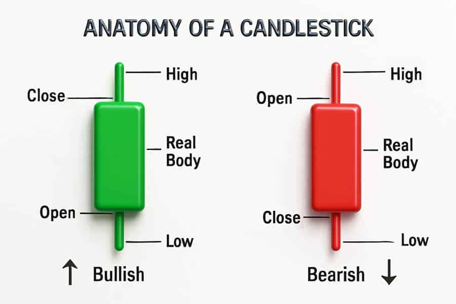
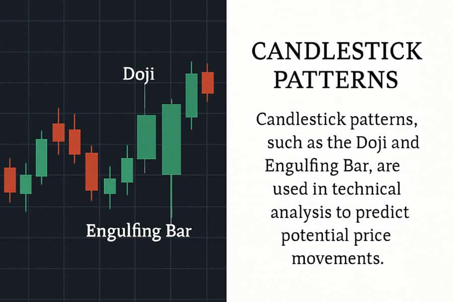
Anatomy of a candle
As detailed in educational resources from institutions like the CME Group, each candlestick tells a story of the battle between buyers (bulls) and sellers (bears) over a fixed time period. It consists of four key data points:
- Open: The price at the beginning of the period.
- High: The highest price reached during the period.
- Low: The lowest price reached during the period.
- Close: The price at the end of the period.
The “real body” is the thick part of the candle representing the range between the open and close. The “wicks” or “shadows” are the thin lines extending from the body to the high and low. The color of the body (typically green for a close above the open and red for a close below) gives an instant visual cue of the period’s net direction.
Why time-based context still matters
Time provides structure. Market openings, economic data releases, session closes, and weekly options expirations are all time-dependent events. Financial institutions often execute large orders at specific times of the day. A candlestick chart frames price action within this human, event-driven context. A sharp move on a 9:30 AM EST 1-minute candle has more significance than the same move at 2:15 PM EST because one aligns with the cash market open and the other doesn’t. Time provides a universally understood framework for analysis.
Best intervals for swing vs position trades
The versatility of time-based charts is a key part of their appeal. The interval you choose should directly reflect your trading horizon:
- Day Traders: Often use 1-minute, 5-minute, or 15-minute charts to make decisions within a single session.
- Swing Traders: Typically rely on 1-hour, 4-hour, and daily charts to capture moves that last several days to a few weeks.
- Position Traders & Investors: Focus on daily, weekly, and even monthly charts to analyze long-term trends spanning months or years.
Side-by-Side Data Test
Theory is useful, but seeing is believing. Let’s compare a 1-minute candlestick chart against a 2,000-tick chart on the same asset (E-mini S&P 500 futures) during a volatile period. The goal is to measure tangible differences in signal quality.
Screenshot of 1-minute candlestick vs 2,000-tick on same asset
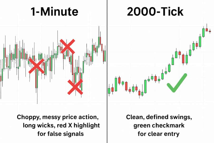
On the left, a 1-minute candlestick chart shows a choppy, downward-trending price with several overlapping candles and long wicks. On the right, a 2,000-tick chart of the same period shows cleaner, more defined swing highs and lows. The tick chart displays a clear bearish impulse move with three distinct, large red bars, followed by a small, tight consolidation, offering a much cleaner entry signal than the messy candlestick chart.
Measured difference in entry latency, false breakouts
In the example above, the candlestick chart produced three potential reversal signals (hammers and dojis) that turned out to be false breakouts, luring traders into counter-trend positions too early. Each of these false signals would have resulted in a stopped-out trade.
The 2,000-tick chart, however, painted a different picture. Because it ignores time and focuses on transactions, the period of indecision (the “chop” on the time chart) formed only a few small, tight bars. The actual bearish momentum burst was captured in three clean, powerful tick bars. A trader waiting for a break of the consolidation on the tick chart would have entered the short trade later, but with much higher confirmation, avoiding the whipsaw losses seen on the time-based chart.
Mini-table: average risk in pips, signal clarity, trade frequency
| Metric | 1-Minute Candlestick | 2,000-Tick Chart |
|---|---|---|
| Average Risk (Pips/Points) | 8-10 points (due to long wicks) | 4-5 points (tighter bars at turns) |
| Signal Clarity | Low (many false signals) | High (clear impulse vs. consolidation) |
| Trade Frequency | High (encourages over-trading) | Lower (filters out low-quality setups) |
This data test highlights a key tick chart vs candlestick advantage: tick charts often provide higher-fidelity signals at critical market turning points, leading to reduced risk and fewer false entries.
5 Advantages of Tick Charts (With Caveats)
For certain trading styles, tick charts offer a distinct edge that time-based charts simply cannot match. Here are five key advantages.
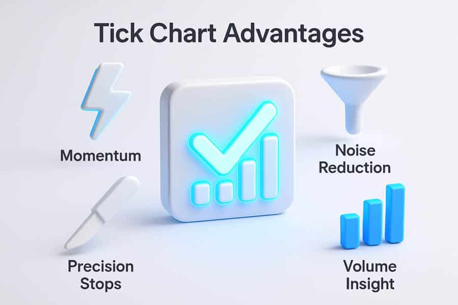
Captures momentum bursts sooner
Tick charts are built to measure activity. When a wave of aggressive buy or sell orders hits the market, a tick chart will start printing bars rapidly, visually signaling the surge in momentum as it happens. A 1-minute candlestick chart must wait for the full 60 seconds to close, by which time a significant portion of the initial move may have already occurred. This makes tick charts superior for momentum and breakout strategies.
Filters dead hours to reduce over-trading
One of the biggest pitfalls for day traders is over-trading during slow, directionless periods like the midday lull. A 5-minute chart will continue to print 12 bars every hour, tempting traders to find patterns in the noise. A tick chart, however, will slow to a crawl. The lack of new bars is a powerful, passive signal to stay out of the market, preserving capital and mental energy for when real opportunities arise.
Reveals professional vs amateur volume spikes
On a tick chart, you can analyze the “character” of the bars. A large price move on just a few tick bars might suggest an illiquid market or amateur-driven panic. Conversely, a sustained, powerful trend composed of many consecutive, healthy-sized tick bars is more indicative of institutional participation. This provides a nuanced view of the volume behind a move.
Tighter stops at swing turns
Because tick charts consolidate tightly during periods of low activity before a breakout, they often form very small, well-defined bars at swing highs and lows. This allows traders to place their stop-loss orders much closer to their entry point compared to the often-long wicks of time-based candles in the same area. This directly translates to smaller risk per trade and an improved risk-to-reward ratio.
Caveat: variable pace can overwhelm beginners
The primary advantage of tick charts—their variable speed—is also their biggest challenge. During a major news event, a tick chart can accelerate to a blinding pace, with dozens of bars printing in a single minute. For an inexperienced trader, this can be disorienting and lead to panicked decisions. It requires a calm mindset and a focus on the patterns, not the speed.
Read More: Forex Charts: A Comprehensive Guide for Beginners
5 Advantages of Candlestick Time Charts
While tick charts offer surgical precision, candlestick charts provide the strategic map. Their popularity is well-earned due to these five enduring advantages.
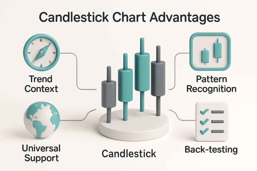
Big-picture trend framing
The fixed time axis of a candlestick chart is its greatest strength for trend analysis. By looking at a daily or 4-hour chart, a trader can instantly gauge the market’s primary direction, identify key support and resistance levels, and understand the broader context. This “top-down” analysis is fundamental to sound trading, and time-based charts make it intuitive. The tick chart vs candlestick time chart comparison often concludes that time is essential for context.
Easier pattern recognition
Classic candlestick patterns like the engulfing bar, doji, hammer, and morning star are universally recognized and taught. These patterns, which signal potential reversals or continuations, are defined by their appearance over specific time intervals. While similar patterns can form on tick charts, their meaning is less standardized, making candlestick charts the go-to for classic pattern-based trading.
Universal platform support
Every single trading platform and charting package in the world, from institutional-grade terminals to free mobile apps from your forex trading broker, supports candlestick charts. This universality makes them accessible to all traders, regardless of their budget or technical setup. Tick charts, on the other hand, are often considered a premium feature found only on specialized platforms.
Better back-testing consistency
Back-testing a strategy on time-based data is straightforward. Each bar represents a fixed, consistent unit of time, which simplifies the programming logic and ensures the test results are repeatable. Back-testing on tick data is far more complex. The variable duration of each bar and the sheer volume of data make it computationally intensive and can lead to inconsistencies depending on the quality of the tick data source.
Caveat: fixed bars hide liquidity holes
The biggest weakness of a time-based chart is that it can mask what’s happening “under the hood.” A 5-minute candle can look completely normal, with a full body and small wicks, yet it might have formed on dangerously low volume. These “liquidity holes” can lead to unexpected slippage. A tick chart would immediately reveal the low activity by taking a very long time to form a single bar, warning the trader of the poor conditions.
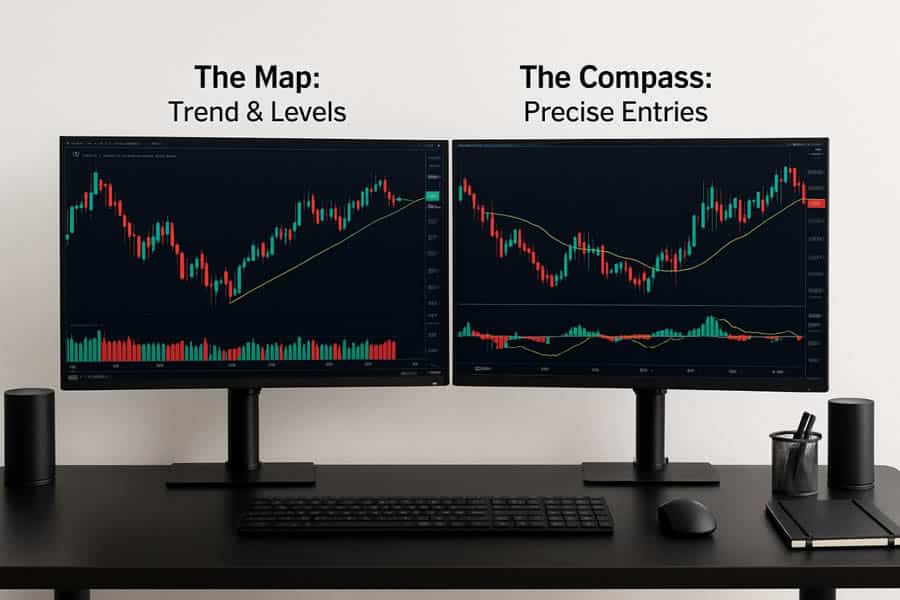
Pro Workflow: Layer Both Charts
The most sophisticated answer to the tick chart vs candlestick question is: “Why choose?” Professional traders often use a hybrid approach, leveraging the strengths of both chart types to build a complete market view.
Dual-monitor layout (tick for entries, candles for bias)
A common professional setup involves two monitors (or a split-screen layout):
- Monitor 1 (The “Map”): Displays a higher time-frame candlestick chart, such as a 15-minute or 1-hour chart. This chart is used to identify the dominant trend, draw major support and resistance levels, and determine the overall trading bias (e.g., “I am only looking for long trades today”).
- Monitor 2 (The “Magnifying Glass”): Displays a low-granularity tick chart, like a 1500-tick or 2000-tick chart. This chart is used exclusively for trade execution. The trader waits for the price to reach a key level identified on the candlestick chart and then uses the tick chart to find a precise, low-risk entry signal, such as a micro-consolidation breakout.
Step-by-step: pick tick size (aim 3–5 bars per impulse move)
Choosing the right tick setting is crucial. It’s not a one-size-fits-all number; it depends on the asset’s volatility. A good rule of thumb is to aim for a setting that produces approximately 3 to 5 clear bars during a typical impulse or momentum move.
A professional futures trader on a popular forum explained their process: “I don’t use a fixed tick setting. Every morning, I look at the pre-market action and adjust my tick value. On a volatile day for NQ, I might use a 2000T chart. On a quiet day, a 610T might be better. The goal is to get a clear visual separation between impulse and correction, and that requires daily tuning.”
Risk management grid – match stop size to chart granularity
Your risk parameters should be adapted to the chart you are using for execution. When using the dual-chart method, the stop-loss should be based on the tick chart’s structure, not the candlestick chart. For example, if your 1-hour chart suggests a support level at 4500, but your 2000-tick chart forms a small consolidation and breakout pattern at 4502, your entry should be at the breakout, with a tight stop just below the consolidation’s low (e.g., at 4501), not a wide stop below the 4500 level.
Read More: strongest candlestick patterns
Platform Setup Cheatsheet
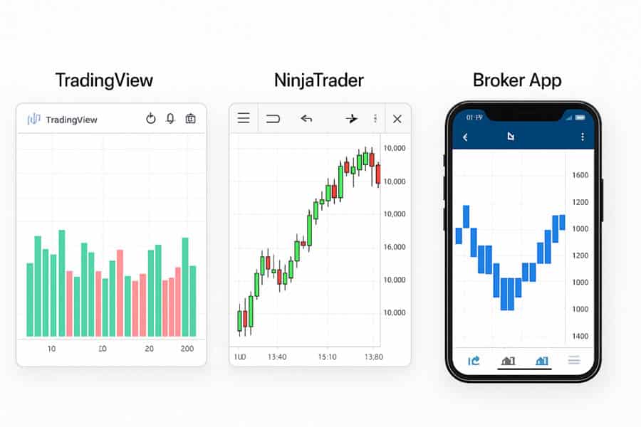
Accessing tick charts can be a challenge depending on your trading platform. Here’s a quick guide for some of the most popular options.
TradingView: “2000T”, “500V”, hotkeys
TradingView, one of the most popular charting platforms, has limited support for true tick charts. You can, however, approximate them. In the symbol interval box, you can type a number followed by “T” for tick, but this feature’s availability may depend on your data feed. A more common workaround is to use Volume-based bars. By typing “500V”, for example, you can generate a new bar for every 500 shares/contracts traded. While not a true tick chart (which counts transactions, not total volume), it provides a similar, activity-based feel.
NinjaTrader & Sierra: link tick + time charts for cross-hair sync
Platforms like NinjaTrader and Sierra Chart are the gold standard for tick chart traders. They are built for this type of analysis. A key feature is the ability to “link” charts. You can have a 5-minute candlestick chart and a 2000-tick chart side-by-side, and your cross-hair will be synchronized across both. This makes it incredibly easy to see how the micro-level action on the tick chart corresponds to the structure on the time-based chart.
Mobile brokers: workaround using range bars when tick unavailable
Most mobile trading apps from forex brokers do not support tick charts due to the heavy data requirements. A viable workaround is to use “Range Bars.” Range bars, like tick bars, remove the element of time. They form a new bar only when price has moved a specified distance or “range.” For example, a 4-point range bar on ES will print a new bar every time the price completes a 4-point move up or down. This also helps in filtering out noise and focusing on pure price movement, making it a good proxy for tick charts on the go.
Trade with an Edge at Opofinance
Ready to apply these charting techniques? Opofinance, an ASIC-regulated broker, provides the powerful tools you need to analyze the market your way. Benefit from:
- Advanced Trading Platforms: Choose from MT4, MT5, cTrader, and the proprietary OpoTrade platform.
- Innovative AI Tools: Gain insights with our AI Market Analyzer, AI Coach, and 24/7 AI Support.
- Flexible Trading Options: Explore Social Trading and Prop Trading opportunities.
- Secure & Easy Transactions: Enjoy safe and convenient deposits and withdrawals, including crypto payments with zero fees.
Take your trading to the next level with a trusted partner.
Conclusion – Match Chart to Market Rhythm
The tick chart vs candlestick debate is not a zero-sum game. The optimal choice is a reflection of your strategy and the market’s current personality. Tick charts listen to the market’s rhythm, building bars based on the pulse of transactions, offering unmatched clarity for scalpers. Candlesticks march to the rhythm of the clock, providing the essential, time-based context needed for swing and position trading. The ultimate edge, however, often comes from combining both, using candlesticks for the map and tick charts for the compass.
What is the best tick size for ES, NQ, and BTC?
There’s no single “best” size as it depends on volatility. However, common starting points for ES are 1500T or 2000T, for the more volatile NQ, 2000T to 4000T, and for Bitcoin futures (BTC), a higher setting like 5000T or more is often necessary due to its high transaction frequency.
Why does my tick chart “freeze” at the lunch hour?
Your tick chart isn’t frozen; the market is. During periods of extremely low activity, like the typical midday lull in equity futures, it can take a very long time for the required number of transactions to occur to print a new bar. This is a feature, not a bug, signaling you to be cautious.
Can I back-test tick strategies?
Yes, but it is significantly more complex and data-intensive than back-testing time-based strategies. You need access to high-quality, historical tick data and a platform (like NinjaTrader or custom scripts) capable of processing it accurately. Results can vary between data providers.
What is the difference between tick and volume bars?
A tick bar is based on the number of transactions, regardless of their size. A 1000-tick bar prints after 1000 individual trades. A volume bar is based on the total shares/contracts traded. A 1000-volume bar prints after 1000 total contracts have changed hands, which could happen in one large trade or hundreds of small ones.
Are tick charts useful for forex trading?
They can be, but with a major caveat. The forex market is decentralized, meaning tick data can differ between brokers and liquidity providers. This can lead to inconsistencies in chart formation. While a forex broker may offer tick charts, they are generally considered more reliable in centralized markets like futures.